Styleguide
The colours, type, components and rules behind the Belmont Framer template.
Every colour and text size comes from a colour token or a text style.
One 12 column grid carries every section, with the same margins and gutters.
Space separates things. There are no divider lines.
Photos zoom inside their frame on hover. Nothing else scales.
Every collection has its own colour.
Background/Page
#FFFFFF
Background/Soft
#EFE7E2
Text/Primary
#451026
Text/Secondary
#83596A
Text/On Dark
#F8F5C7
Text/On Dark Secondary
#F8F5C7 at 72%
Surface/Ink
#451026
Accent/Red
#D34835
Border/Ink
#451026
Border/Field
#451026 at 45%
Border/On Dark
#F8F5C7 at 60%
Overlay/Scrim
#451026 at 38%
Overlay/Image
#1E0A14 at 32%
Collection/Shoreline
#D34835
Collection/Greenfield
#451026
Collection/Old Town
#F2B6D4
Collection/Landmark
#DFD2CA
Collection Text/Shoreline
#F8F5C7
Collection Text/Greenfield
#F2B6D4
Collection Text/Old Town
#451026
Collection Text/Landmark
#451026
Well Placed
Marquee. Google Sans 500. Desktop 200, tablet 150, phone 112 px. Line height 1. Tag p. Giant marquee words only.
Properties
Display H1. Fraunces Light 300, optical size 96. Desktop 64, tablet 52, phone 38 px. Line height 1. Tag h1. The one page title.
Homes that open onto the water
Display. Fraunces Light 300, optical size 96. Desktop 64, tablet 52, phone 38 px. Line height 1. Tag h2. Statements, quotes and calls to action.
Location First
Heading. Google Sans 500. Desktop 44, tablet 36, phone 30 px. Line height 1.08. Tag h3. Two-word highlight titles.
Homes and investment property on the coasts and in the cities of Portugal, Croatia and Greece.
Lead. Google Sans 500. Desktop 22, tablet 20, phone 18 px. Line height 1.3. Tag p. Intros, card titles and prices.
Seafront apartments and villas a short walk from the beach and the marina.
Body. Google Sans 500. Desktop 16, tablet 16, phone 15 px. Line height 1.4. Tag p. Labels, meta, captions and forms.
Properties
Menu. Fraunces Light 300. Desktop 44, tablet 40, phone 52 px. Line height 1.05. Tag p. Links in the menu panel.
Greenfield
Card Title. Fraunces Light 300. Desktop 40, tablet 32, phone 26 px. Line height 1. Tag p. Collection Card titles.
Belmont
Wordmark. Google Sans 500, uppercase. Desktop 22, tablet 20, phone 18 px. Tracking 0.32 em. Tag p. The logo in the header.
Inline Link. Wine with a vermilion underline that clears on hover. Links inside running text.
Quiet Link. Wine, fades to Text/Secondary on hover. Header, footer and collection links.
Quiet Link On Dark. Butter, muted on hover. Menu panel and wine bands.
Arrow Link. Dark and Light variants with label and link controls. Standalone links such as Get in touch.
Button. Primary (wine, vermilion on hover) and Outline variants with label and link controls.
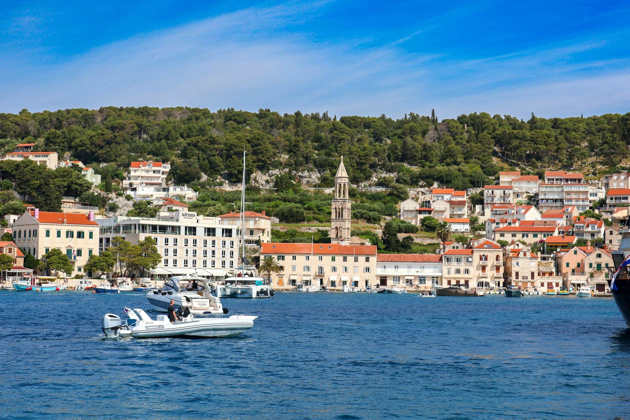
Property Card. Photo, title, location, price, bedrooms, bathrooms, area and link. The photo zooms to 1.04 on hover.


Collection Card. Default and Small variants for the Explore collections overlay. Title, tagline, colours, photo and link come from the Collections CMS.
Breakpoints: desktop from 1200 px, tablet from 810 px, phone below.
One 12 column grid. Margins are 56, 40 and 20 px and gutters 32, 24 and 16 px on desktop, tablet and phone.
Spacing scale: large 160, 120 and 88 px, medium 96, 80 and 64 px, small 48, 40 and 32 px. Neighbouring sections of the same colour share one gap.
Sections run full width with no maximum width. Media corners are square. The fixed header is transparent over the hero and turns solid white after it.
A preloader opens every page: a counter climbs while photos flip, then it lands on the hero square.
Explore collections shrinks the page into a preview while the collection cards drop in as colour blinds and their photos open.
Collection heroes grow from a square to full screen as you scroll.
Hovers answer in 0.15 s. Photos zoom to 1.04 inside their frame.
Smooth scroll is a toggle on the Main layout template.
Collections: Title, Slug, Tagline, Lead, Price From, Color, Text Color, Order, Hero Image, Statement, Statement Body, Gallery with alt text, Quote with name and role, two wide images, three highlights with title, text and image, Long Quote with source, and CTA Title.
Properties: Title, Slug, Location, Price, Bedrooms, Bathrooms, Area, Summary, Cover, Gallery with alt text, Description, Order and a Collection reference.
Order sets the sequence everywhere. Each property links to its collection page through the reference.
Every cover is used once. Galleries may repeat photographs.
Belmont
Remix project